Every retirement tool shows you a chart. Almost none show you whether the chart has ever been checked against reality. That’s the difference this piece is about — because a forecast is only as honest as the math underneath it, and the only way to know if that math is honest is to test it against the past and see where it breaks.
So here’s how Arthea actually builds a forecast. And then the uncomfortable part: a real case where our own model got it completely wrong.
We don’t predict. We replay history, thousands of times.
The naive way to forecast wealth is to pick one average return — say 5% a year — and draw one smooth line to age 95. We wrote a whole piece on why that single line is the most dangerous number in your plan. The short version: markets never deliver returns in a tidy, average order, and your retirement only gets one actual sequence of good and bad years.
So instead of assuming an order, Arthea samples real ones. The engine takes a window of actual historical returns and replays stretches of it — with the real crashes, the real calm years, the real way bad years cluster together — reshuffling the pieces into thousands of plausible orderings. Run that ten thousand times and you don’t get a line; you get a distribution of where your money could end up. This is Monte Carlo simulation, and the specific method is a block bootstrap: we sample real multi-year blocks of history rather than drawing single years from a bell curve.
That choice matters. A bell curve (a “normal” or “lognormal” distribution of returns) is smooth and well-behaved. Markets are neither. Real returns have fat tails and momentum — crashes are deeper and more clustered than a bell curve admits. By replaying actual historical blocks, the ugly years stay ugly and stay bunched together, which is exactly why sequence-of-returns risk shows up in our fan on its own, instead of being bolted on afterward.
One thing we are careful not to say: we are not “training” a model or learning a pattern. Nothing is fitted. No AI model. The engine resamples observed history and compounds it. That’s a humbler, more honest operation than the word “AI forecast” usually implies.
History sets the shape. Your view sets the level.
There’s a seam inside every honest forecast: the past tells you how bumpy markets are, but it can’t tell you how high or low they’ll go from here. Bond yields, valuations, and starting conditions today aren’t what they were in 1995.
So Arthea separates the two. The historical sample sets the shape of the distribution — the volatility, the clustering, the depth of the tails. A separate, adjustable view sets the level — how optimistic or cautious the central return is. When you pick a planning stance (from neutral down to a genuine stress posture), you’re shifting the level and choosing which part of the range you plan against, without touching the realistic bumpiness underneath. The two stay internally consistent because they operate in the same space.
We show the spread, not a single promise.
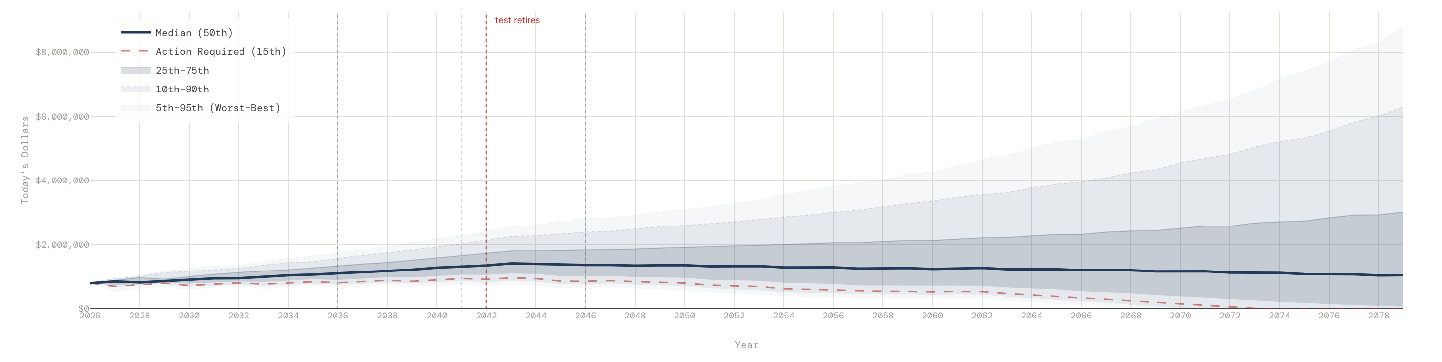
The result is a fan chart: the median outcome, and bands around it — the 25th to 75th percentile, the 10th to 90th, and the outermost 5th to 95th, from “things went beautifully” to “things went badly.” A red dashed line marks the 15th percentile — our “action required” threshold, the point where a plan is fragile enough to need attention.
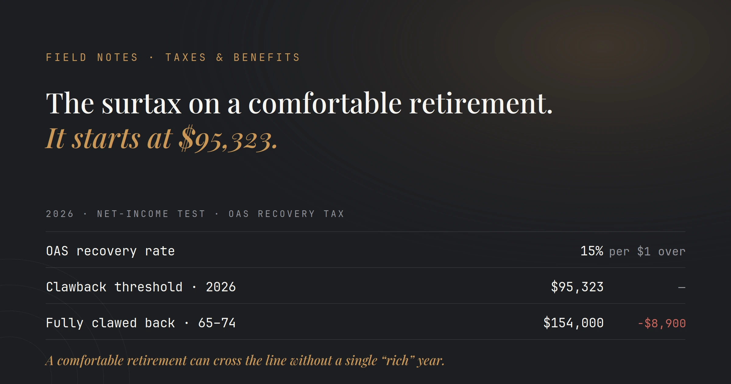
And a small honesty detail most tools skip: when we show you a year-by-year table of dollars, we don’t stitch together the median of every year into a single fake path (real paths are never that smooth). We show one actual simulated path — the single run that landed closest to your planning percentile. It’s a real sequence, not a flattering composite. Everything is in today’s dollars, and Canadian tax — RRSP/RRIF drawdowns, CPP and OAS, the OAS clawback — is estimated every year of every path, not bolted on at the end.
Now the uncomfortable part: we checked our own bands against history.
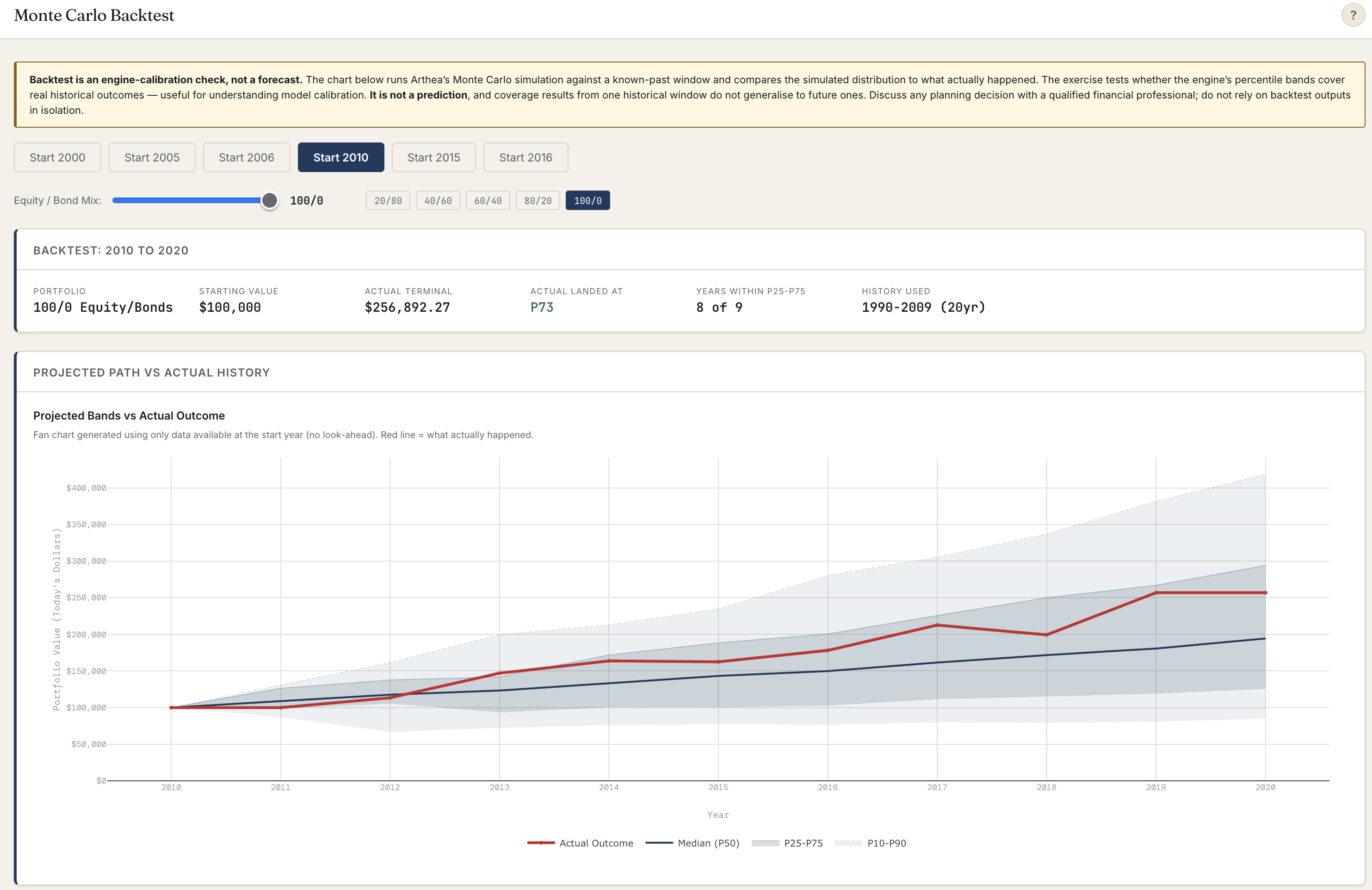
Here’s the test almost nobody runs in public. Take a real starting point in the past — say the year 2000 — and build a forecast using only the information available then. No peeking at what happened next. Then lay the fan over what actually happened and ask a blunt question: did reality land inside the bands we would have drawn?
We ran it for a 100% equity portfolio at several start years. Three tell the whole story.
Start 2010. Actual outcome landed at the 73rd percentile — comfortably inside the fan, with 8 of 9 years falling within the middle band. A clean pass. The reason it worked: the history the engine drew on (roughly 1990–2009) already contained the dot-com crash and 2008, so its “bad years” were bad enough.
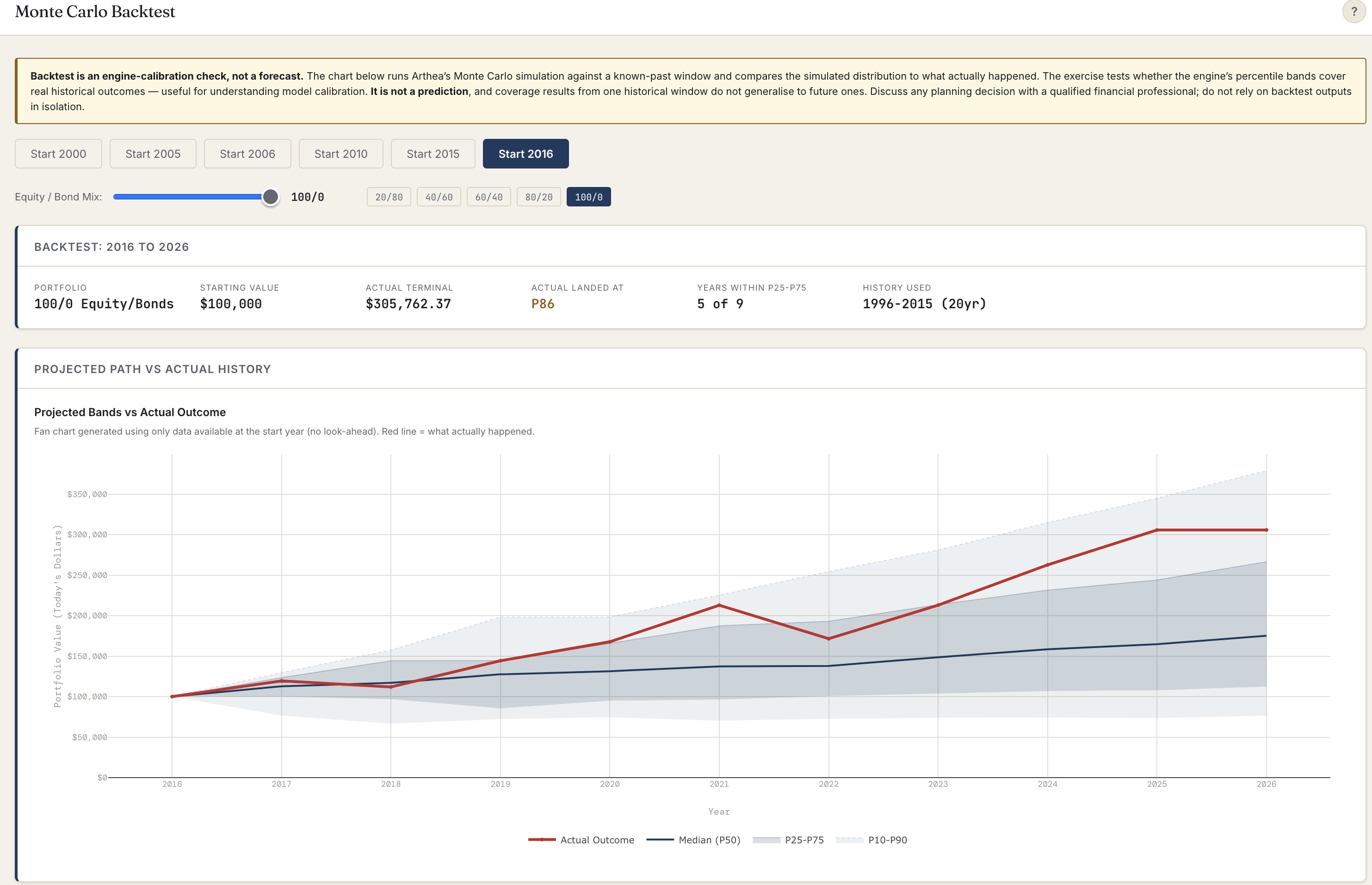
Start 2016. Actual landed at the 86th percentile. Reality ran hot — a long bull market pushed the outcome into the optimistic upper band. The bands held, but only just, and on the sunny side.
Start 2000. Actual landed at the 0th percentile. Below the entire fan. A $100,000 portfolio didn’t just underperform the median — it lost money over the decade, ending around $84,000, while our lowest band still pointed comfortably upward. The forecasts wasn’t a little off. It missed completely.
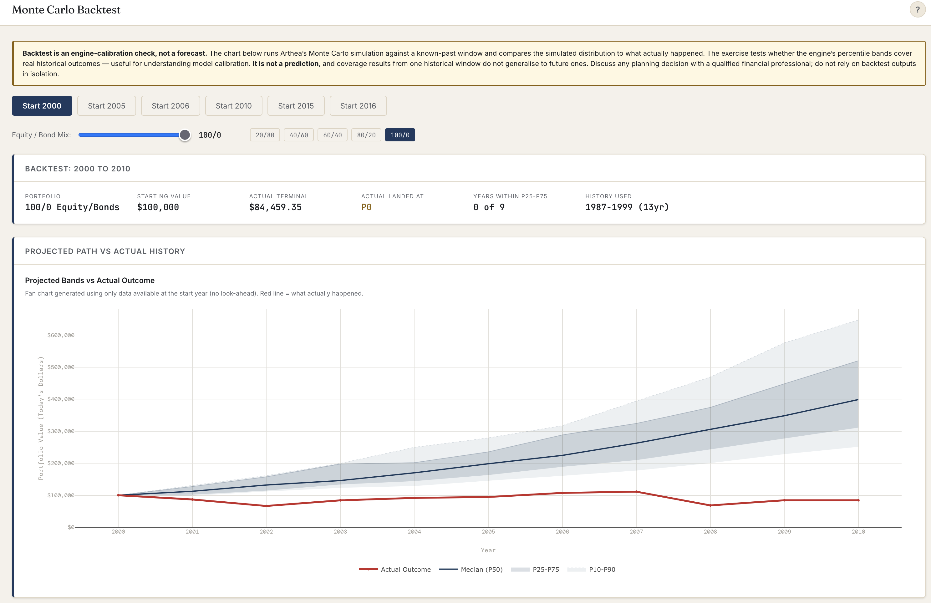
We’re showing you that one on purpose, because it teaches the single most important thing about any forecast — ours included.
Why it broke, and why more computing power wouldn’t have saved it
It’s tempting to assume a miss like that means “run more simulations.” It doesn’t. The engine drawing the year-2000 forecast sampled its returns from the roughly thirteen years before it — 1987 to 1999 — which was one of the great bull markets in history. Nothing in that sample was as bad as the “lost decade” that actually followed. So the true range of outcomes was worse than anything the sample could produce. Running ten thousand more paths would only have given us a sharper picture of the same too-optimistic distribution.
This is the trap: a model is only as pessimistic as the worst history you feed it. Sample a bull market, and your worst case isn’t nearly bad enough.
There’s a deeper statistical point underneath, and it’s worth getting right because it’s widely misunderstood. Running thousands of simulations makes your estimate of the distribution stable and precise. It does not mean a single real outcome will land near the median. The law of large numbers is about the average of many independent draws converging — but your actual retirement, and any single stretch of history, is one draw. One draw can land anywhere. A well-calibrated engine doesn’t make outcomes cluster on the median; it makes them scatter across the percentiles, with roughly half landing in the middle band over many independent tests. Our three results — 73rd, 86th, and a brutal 0th — are that scatter. The 0th is the one that flags where our sampled downside was too thin.
What we do about the futures history can’t contain
If the backtest proves history alone isn’t enough, the answer can’t be “sample more history.” It has to be: deliberately imagine worse than the record shows.
So alongside the historical sampling, Arthea runs stress tests that don’t wait for the sample to volunteer a disaster. You can force the worst-documented retirement sequence in North American history — the 1966 cohort, who retired straight into stagflation. You can force a punishing return window right around your retirement date, when sequence risk does the most damage. You can name a scenario — a Lost Decade, a 2008 replay, persistent inflation — and watch your specific plan absorb it. And the 15th-percentile “action required” line is always on the chart, so the fragile case is never hidden behind the median.
None of this makes Arthea a crystal ball. That’s the point. The honest goal isn’t to predict your future — it’s to show you the range of futures your plan can and can’t survive, to admit where the model’s imagination runs out, and to deliberately test beyond it.
A single number pretending to be the answer is lying to you. A fan of outcomes you can stress, audit, and — yes — catch being wrong is the honest alternative. That’s the whole reason we built the backtest into the product, and the reason we’re comfortable showing you the run where it landed at zero.
See what your range of outcomes looks like — the good, the bad, and the genuinely ugly — at arthea.ca.
Next in Field Notes: honest math is only half of trust. The other half is what happens to your numbers after you type them in — how Arthea keeps your financial data secure, and why the forecast never needs to know who you are.
Arthea is an educational and analytical tool for Canadian households. It does not provide personalized financial, tax, or investment advice. Backtests are engine-calibration checks, not forecasts; coverage results from one historical window do not generalise to future ones, and past performance is not indicative of future results. Consult a licensed professional for advice specific to your situation.