You can get a free retirement projection in about five minutes. The Government of Canada has one. So does Wealthsimple, TD, and a dozen independent sites. Some are genuinely good. A few now optimize your CPP and OAS timing, model provincial tax, handle OAS clawback and pension splitting, and suggest a withdrawal order. If you’ve never run any of them, go run one this week. It’s worth doing.
Then look closely at what you get back: one clean line, climbing from today to age 95. A single number at the end. “You’ll have $1.4M.” “Your money lasts to 2058.” “You’re 100% funded.”
That clean line is the most dangerous part of the whole exercise — and understanding why is the single most useful thing you can learn about your own retirement.
Every calculator has to make the same quiet assumption
To draw one line, a calculator has to assume your investment returns arrive in a tidy, average order. Say 5% this year, 5% next year, 5% the year after — politely, on schedule, forever. Some tools let you change the 5% to 6% or 4%. Very few change the shape: the assumption that returns show up smoothly, in roughly the same order as their long-run average.
Markets have never once behaved that way.
Real returns are violent and out of order. +22% one year, −18% the next, flat for three, then +30%. The long-run average can still come out to 5% — but the path getting there is jagged, and the order of those jagged years is completely random. You don’t get to choose it.
Here’s the part that matters: your retirement only gets one path. Not the average of a thousand possible futures — one actual sequence of good and bad years, in one specific order, and you find out which one you got only as it happens.
Why the order is life-or-death (and why it wasn’t, while you were saving)
While you’re still working and contributing, a market crash is almost good news — you’re buying in cheap, and you have years of paycheques ahead to recover. The order of returns barely matters to you.
The moment you retire, that flips completely. Now you’re withdrawing instead of contributing. And a bad year early in retirement does something a spreadsheet’s average hides: to cover the same grocery bill, the same property tax, the same trip, you have to sell more units of your investments because each one is worth less. Those extra units you sold are gone. They aren’t there to participate when the market recovers.
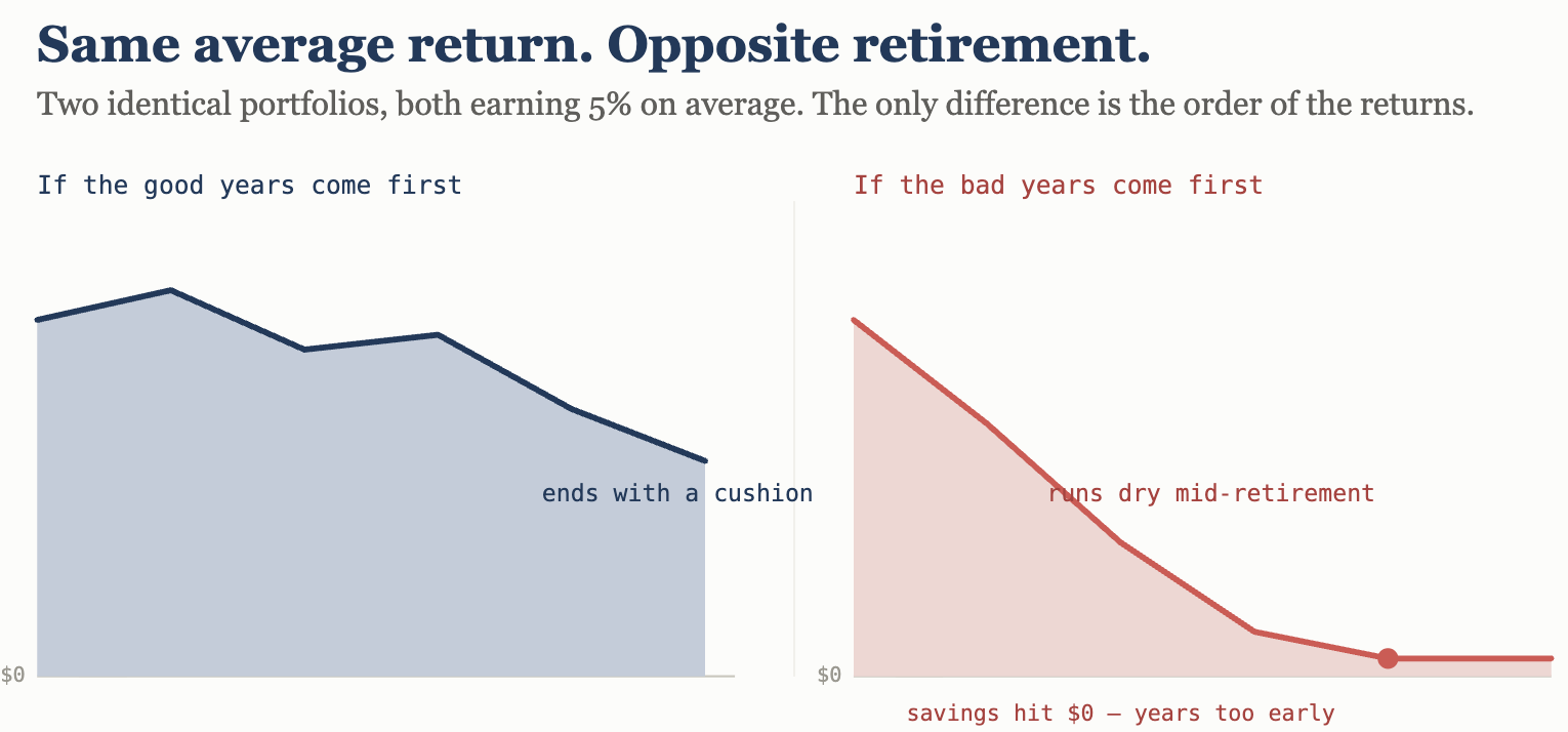
Two people can earn the exact same average return over 30 years. The one who hit their bad years first can run out of money. The one who hit the same bad years last dies with a surplus. Same average. Same portfolio. Opposite outcomes. The only difference is the order — and a single-line calculator, by its very design, cannot show you this. It answers “what’s the average?” when the question that actually ends retirements is “what happens if I’m unlucky about the timing?”
This has a name in the profession: sequence-of-returns risk. It is arguably the single biggest threat to a Canadian retirement, and it is precisely the thing a one-line projection is structurally incapable of modelling.
The other number nobody asked you to approve
There’s a quieter problem sitting inside that clean line: the rate of return it assumed in the first place.
An advisor or a tool that models 7% makes your plan look dramatically healthier than one that models 5%. A healthier-looking plan means you can save less, retire earlier, and worry less — so the optimistic number is the easy one to reach for. It isn’t always deliberate. But the incentive runs one direction, and most people were never actually asked, “Do you approve this assumption?”
For a balanced Canadian portfolio, honest ranges today look something like: optimistic 6–7%, prudent 4–5%, stress-test 2–3%. Which one your plan uses is a decision — and it should be your decision, made with your eyes open, not a default buried in a tool.
What testing for this actually looks like
The fix isn’t a better single number. It’s refusing to accept a single number at all.
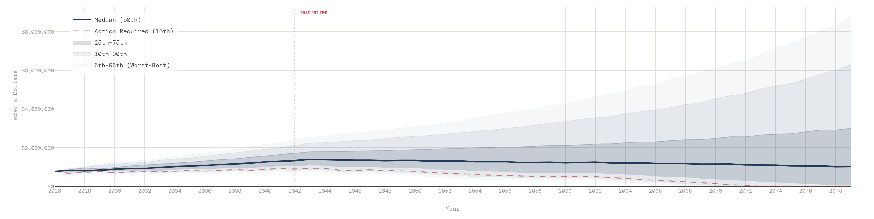
- A range instead of a line. Instead of one path, run thousands of simulated futures — the good, the median, and the genuinely ugly — and look at the spread. A plan that’s “fine” in the median and catastrophic in the bottom tenth is not a fine plan. This is what a Monte Carlo simulation does, and it’s why the honest picture is a fan of outcomes, not a single promise.
- Named stress scenarios. Don’t just imagine “a downturn.” Test your actual plan against a Lost Decade, a stagflation stretch, a 2008 replay landing right at your retirement date — and watch what it does to the money.
- A withdrawal answer for the bad case. Not “how much could I spend if everything goes right,” but “how much can I take out and still survive the scenario that keeps me up at night?”
- Everything in today’s dollars. A number in 2055 dollars is impossible to feel. Translate it back to what it buys now.
Why we built Arthea around this
Most free tools compete on being fast, free, and reassuring. We built Arthea to be honest instead — to show you the range of what could happen rather than a single comforting line, to let you name the scenario that scares you and see exactly how your plan holds up, and to give you a defensible answer in today’s dollars.
The point isn’t to predict the future; no tool can, and any that claims to is the one to distrust. The point is to walk into your next conversation — with your advisor, or your spouse at the kitchen table — holding your own analysis, including the ugly cases, instead of only the version you were handed.
Free calculators tell you whether your plan works when everything goes right. The harder, more important question is what happens when it doesn’t. If your plan only survives the optimistic case, that isn’t a plan. It’s a hope with a chart.
Run your numbers — the good, the bad, and the ugly — at arthea.ca.
Arthea is an educational and analytical tool for Canadian households. It does not provide personalized financial, tax, or investment advice. Projections model uncertainty; they do not predict outcomes. Consult a licensed professional for advice specific to your situation.